More Work On Fancy Tilesets, Just To Go In The Garbage

Mika made this fantastic garden hedges tileset, but with it we were starting to notice issues. Firstly, the decorations weren't really looking that great, and the overhead thing wasn't working out either. Also, the floor tiles here are difficult to look at. It's hard to tell where a "grid" is, which is pretty important in a puzzle game like this. We'll come back to this though.
Colorful Blobun
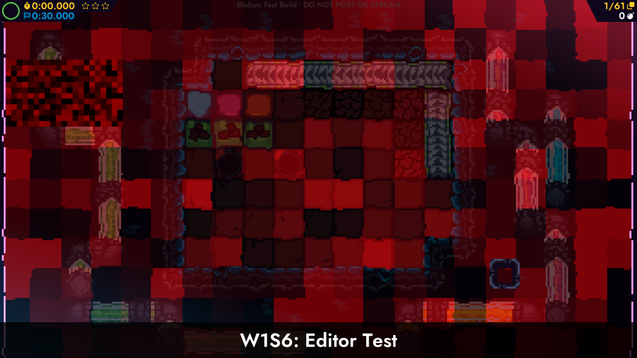
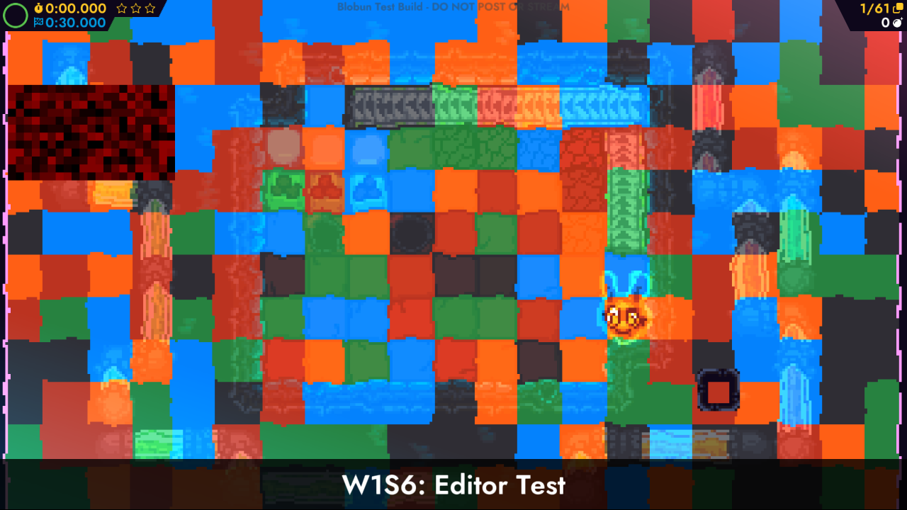
Roxy started working on a recoloring system for Bun. The general idea here is that, you get different powerups that change your state, and you also change colors. This works by using a texture that says what palette offset to use on each tile, and then using a shader to create the final color. This is why there's a screenshot of the playfield all in red. No, Bun didn't turn evil, it's just shaders.
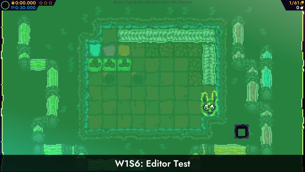
Here's also a screenshot of just the whole playfield covered in slime, if you wondered what that looked like.
Here's the recolor thing working in action, though here we're manually changing the state.
After some more work, it starts looking like this. These special lava tiles can be stepped on only when you've got a water, ice, or fire element state change. Otherwise, you have to start the puzzle over. We have other elements and states planned, and some of them we'll get into later.
World Map Mockup
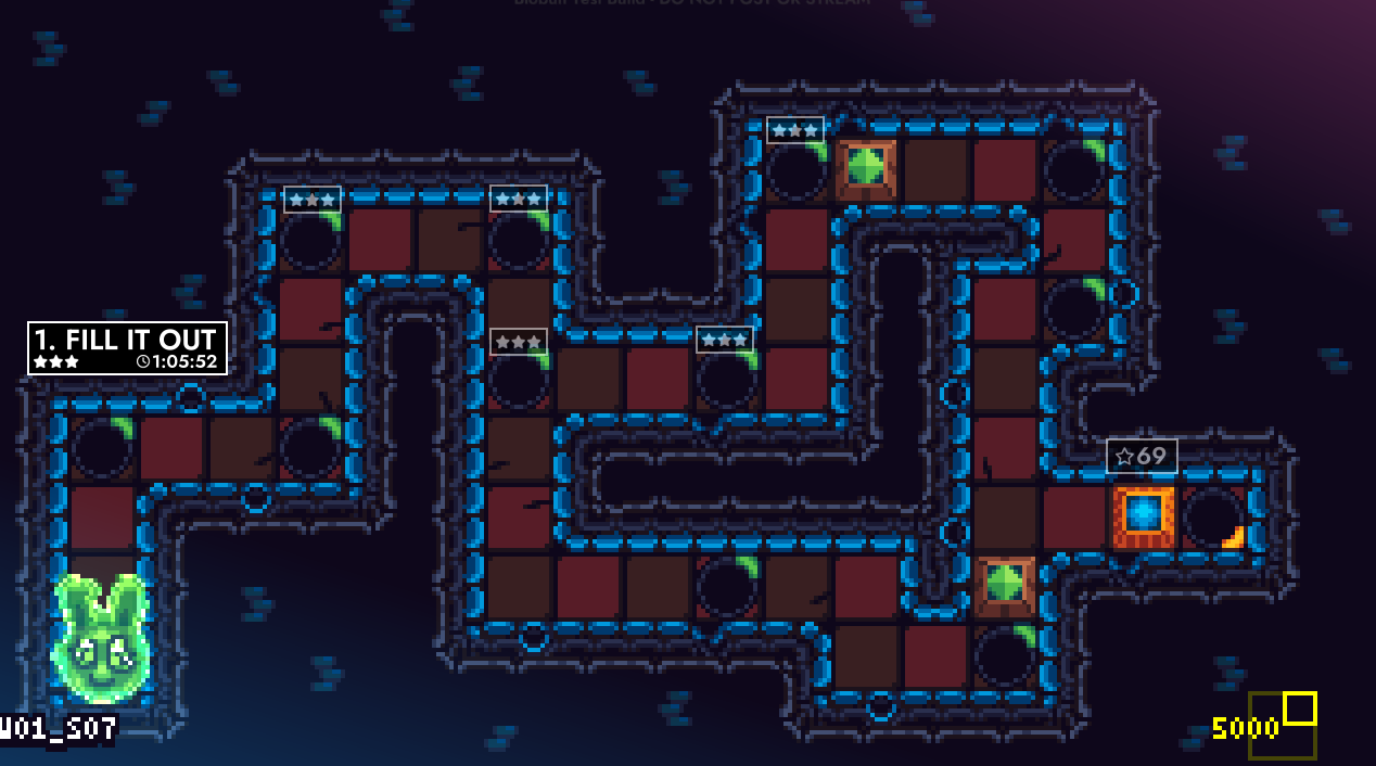
We have a general idea about a world map that you traverse, similar to games like Baba is You and Super Mario Bros 3. You can get a quick overview of stage progress, places you can go, and what you still need to do. This is simply a mockup, but it represents our general plans.
Puzzle Problems
It was at this point that we decided we need to face the graphical design problems head on. The garden tileset really demonstrated an issue, which was that different graphics could make it harder to tell what's a puzzle element and what's part of the stage. Also, making all these different assets would significantly increase the scope of the project.
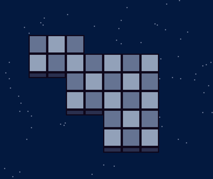
We made this mockup of a puzzle in a liminal space, and people really took to it, so we started trying to work in this direction.
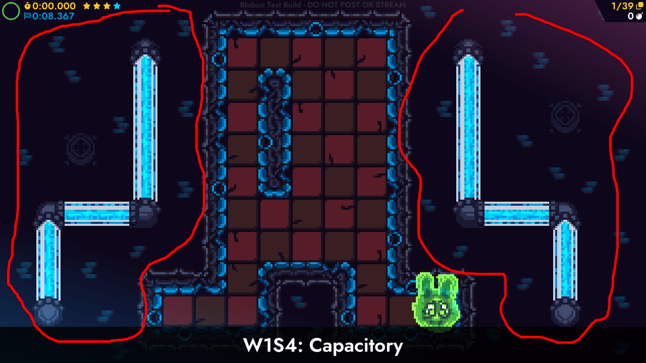
We did like the old direction with the decorations, but the whole decotile system was kinda complex and honestly, just not that great at filling out the edge space. It did work, but we felt like we could do something better. The circled area shows what we didn't really like.
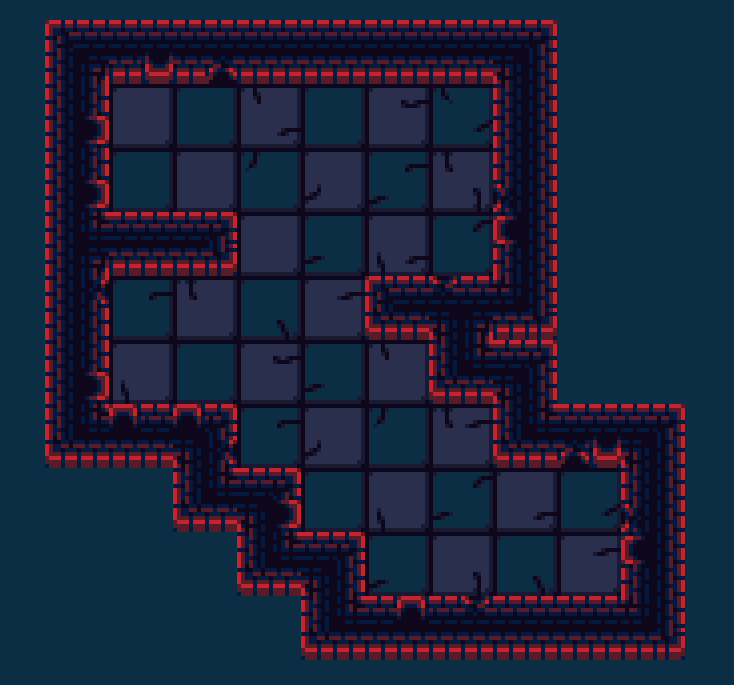
Our initial attempts at a liminal space weren't that great, but it was a good start. We were going to keep the floor decorations, but we ultimately decided not to do that.
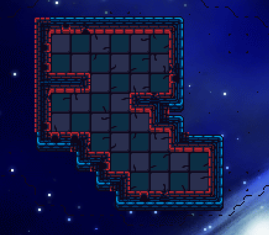
Here's another WIP, using a background from RPG Maker 2003 to further cement the idea we were going for. Now things are starting to make sense.
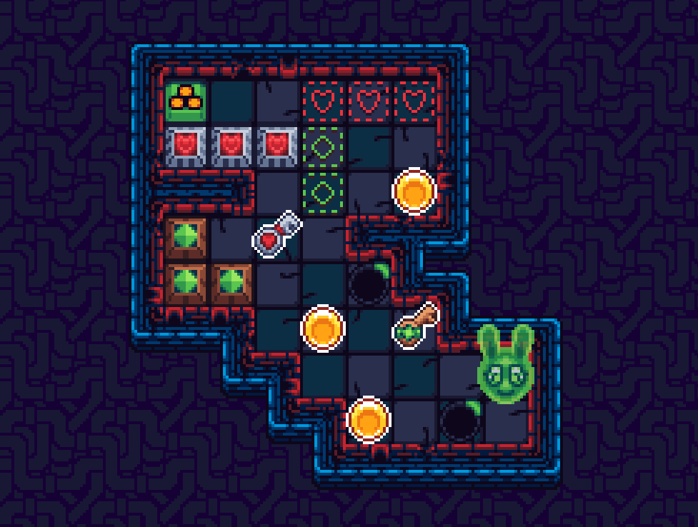
Mika made this mockup, and people quite liked it. However, we felt the borders were much too big still...
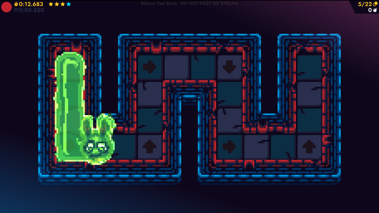
... especially on stages like this.
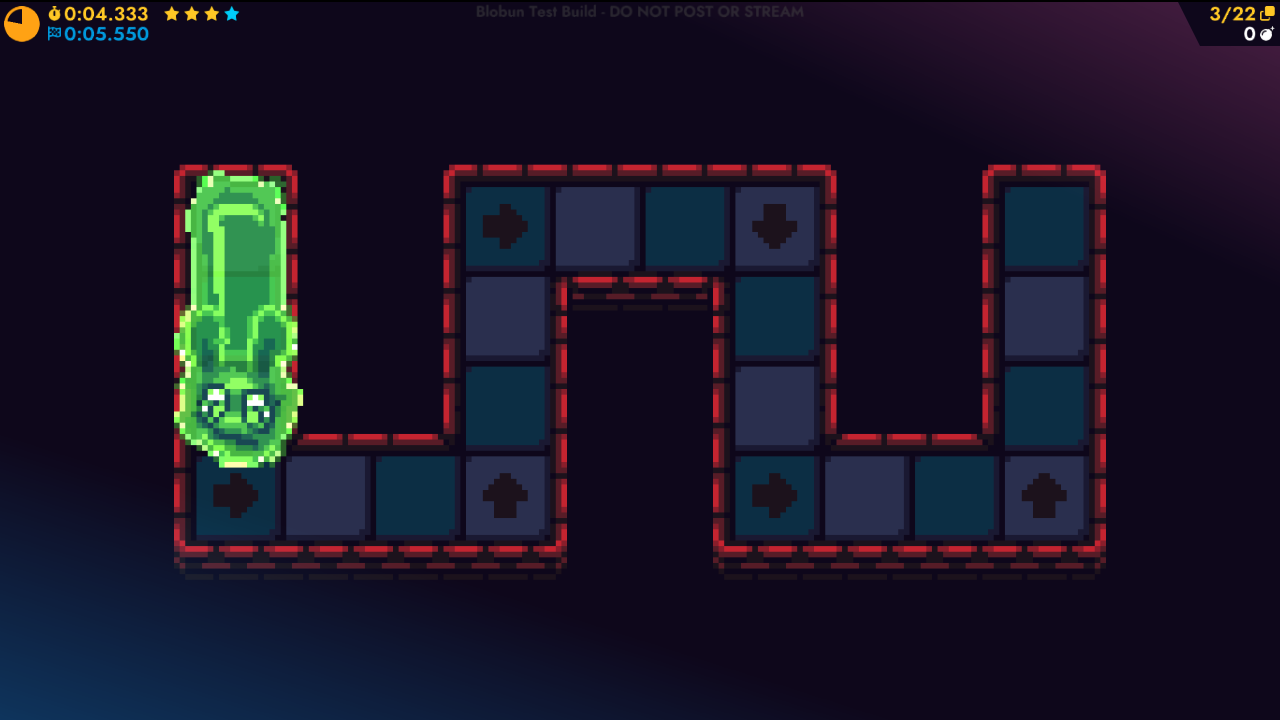
Eventually we came up with this, and it looked a LOT cleaner.
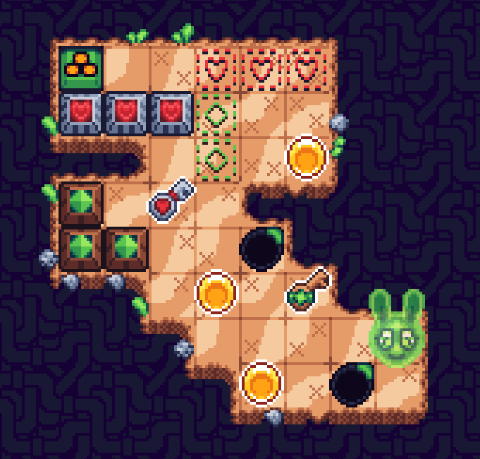
We had an idea to keep the other theming, but as you'll soon see, this didn't pan out either.
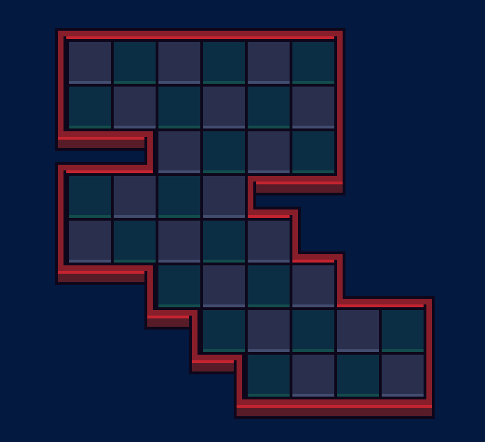
Eventually, we came up with this concept, and people really liked it.
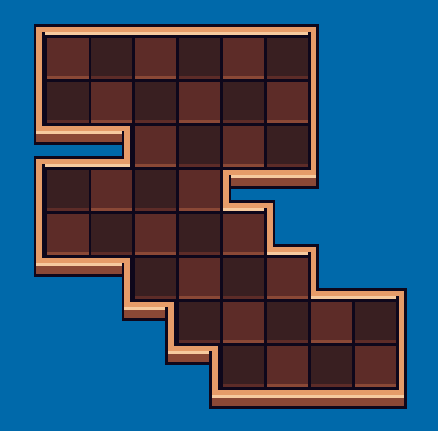
The whole idea was to make something nice and clean, while also allowing us to easily make new themes. Under this new structure, we could just make a pretty background while the game itself otherwise stayed the same visually, just with a different color. We were inspired by the clean look of other games such as Magnibox and Wilmot's Warehouse, which remove any visual clutter to focus on a clean presentation, allowing you to focus on the puzzle and its various elements.
However, we were also feeling that, maybe pixel art wasn't the best fit for this game after all. Because of the way each puzzle is a different size, and the screen zooms in arbitrarily to frame the puzzle, there can be no such thing as a pixel grid... So...
HD Blobun
We began work on making an HD version. We had to fix a lot to make this work, but spoilers, it looks really nice. People really, really liked this, and we like it too, as it solves a lot of visual problems and design challenges we've been facing.
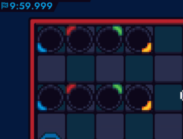
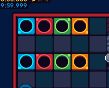
Here you can see the immediate benefits of HD. We have a lot more room to make unique puzzle elements, while keeping the overall style visually clean. You can glance at the puzzle and immediately know where the puzzle elements are.
3D Puzzle Elements
Roxy was wanting to make the game 3D, and I was saying that that would be impossible because we're using Gamemaker, and we'd have to redo way too much to make it work anyways. However, we still ended up with some 3D in the game.
These puzzle elements use 3D models, using the same technique that we used to get 3D models into Shield Cat. Here, however, we don't have to do fancy things to make them not stick out against the pixel art. Everything looks nice and clean.
We started making more elements HD, while also making dedicated platforms for where they are. This gives them a sense of space, being presented on a little pedistal, rather than just being on the puzzle somewhere. This also allows the player to see where the puzzle element was, in case they want to go back and try something else.
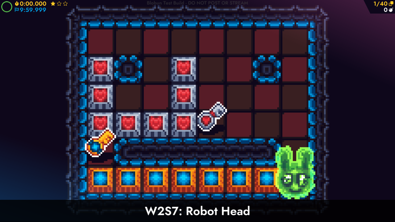
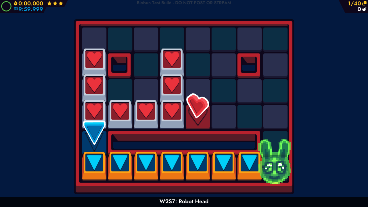
Here's a before and after of the same puzzle.
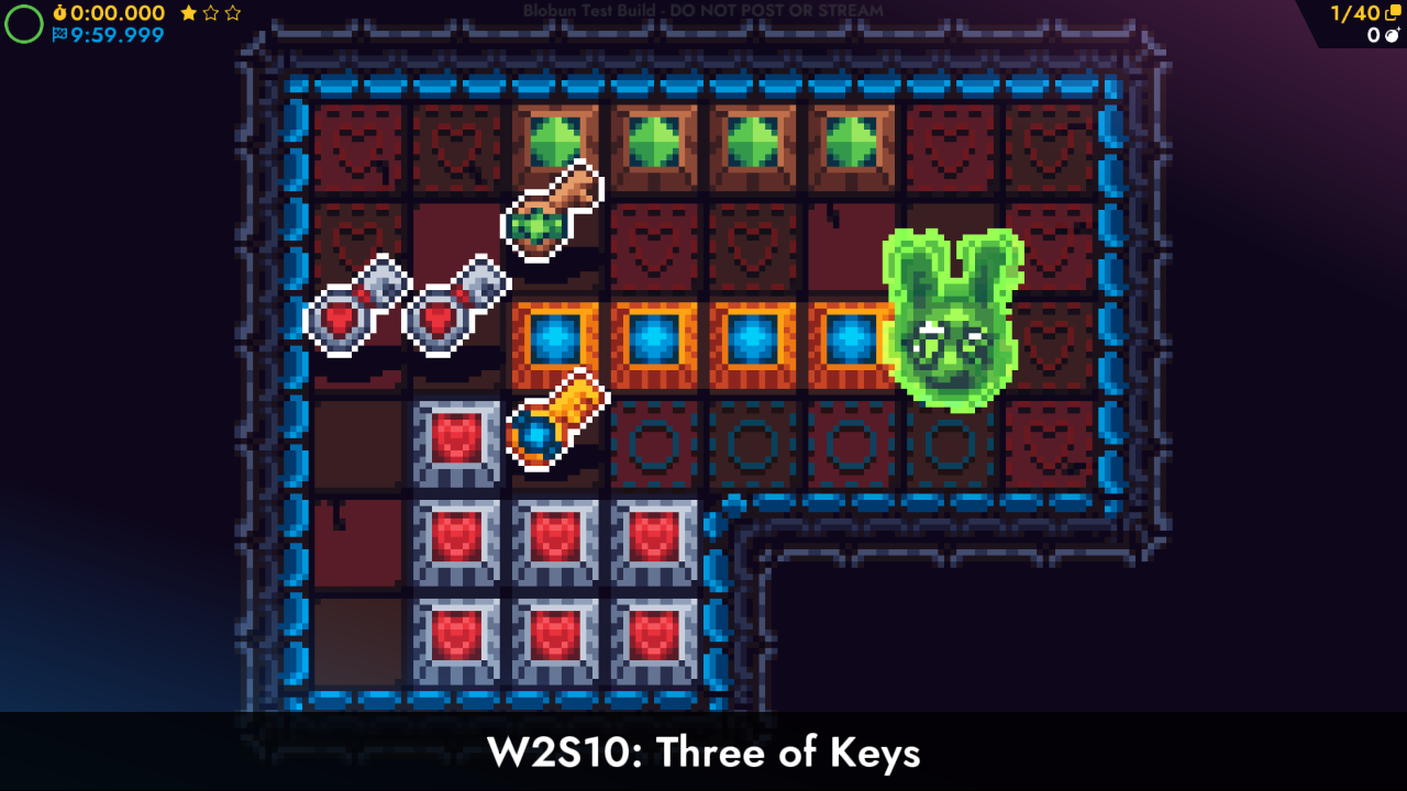
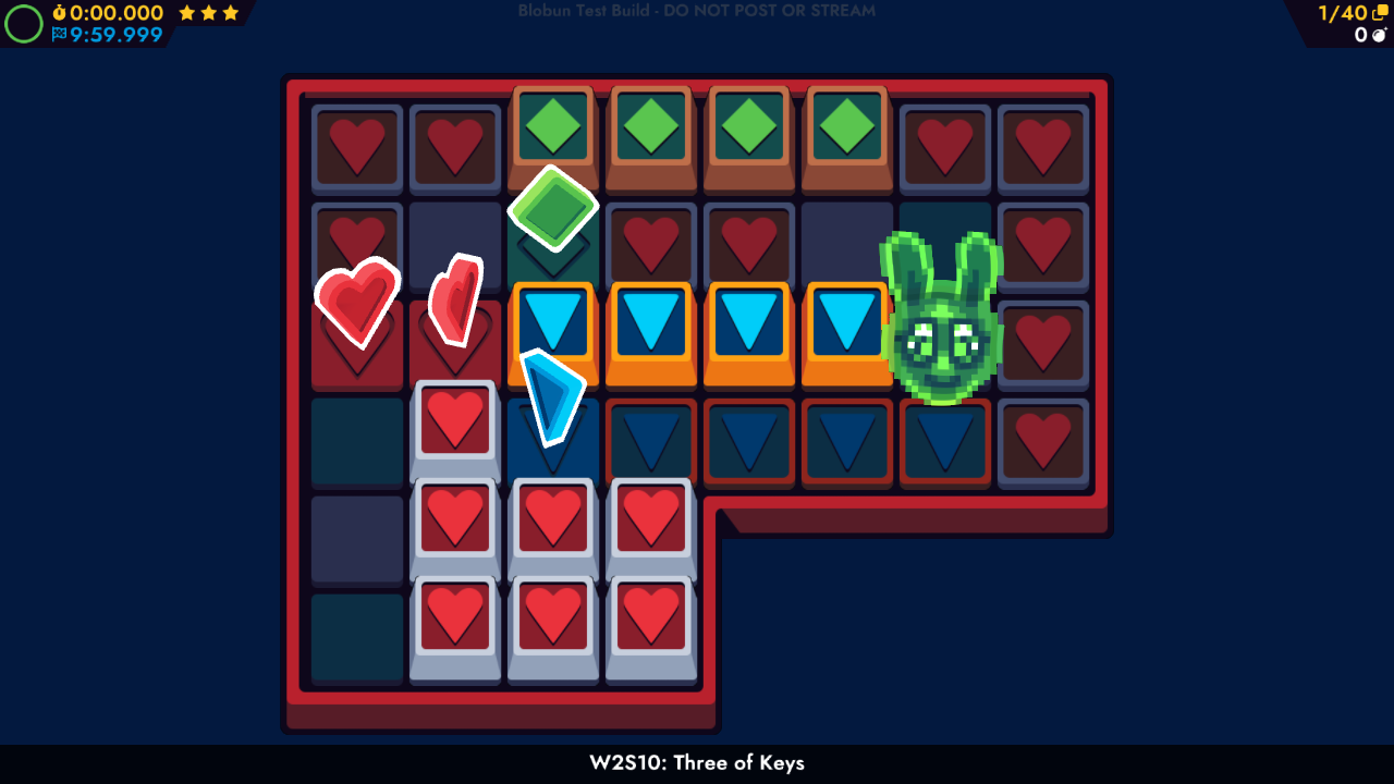
Here's another comparison. You can see here that they're a lot cleaner and easier to look at.
Bun Slime Trail Normal Maps
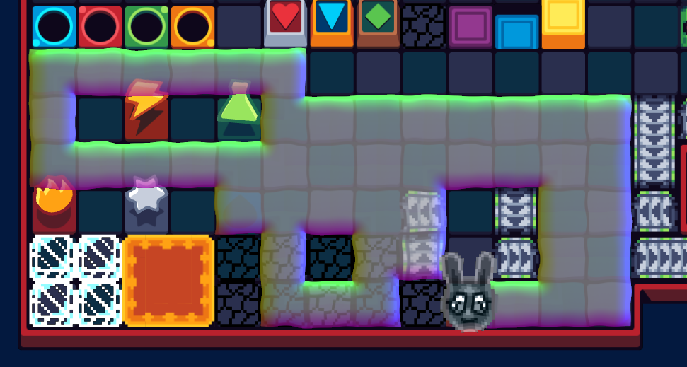
Roxy had this weird idea about making normal maps for the edge of the slime trail, and fought with various art programs to try to get the result she wanted, eventually using Blender to get it.
It was a lot of hard work, but eventually she got there in the end. She also got depth sorting working, somehow. The slime trail and Bun are all on a single layer, so it's very, very tricky to depth sort her and all the puzzle elements together, but she managed to do it.
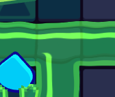
Here's an up-close shot of the new slime trail. You can see the normal map distortion in action.
HD Backgrounds
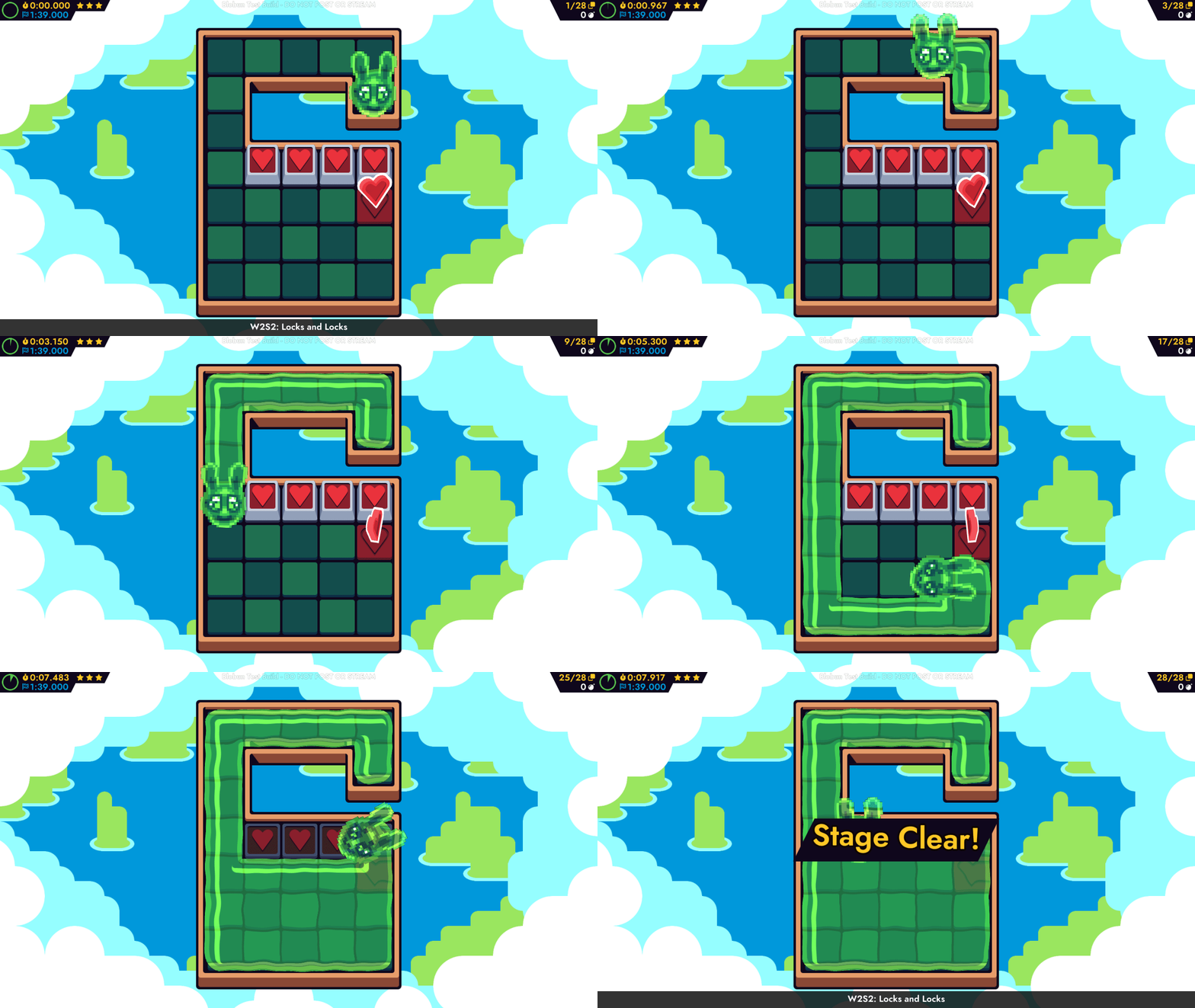
Finally, here's a look at our progress on HD backgrounds. We just have this one right now, but it really shows what's possible. This also shows the general idea, where we can create new stages that focus on having a different background to change things up, but otherwise keep the style generally the same, so that you don't have issues picking out puzzle elements.
That's It For Now
Thank you for reading all this, or at least looking at the pretty pictures. We're quite happy with how Blobun is turning out, and look forward to bringing you more progress blogs as we continue working on it.
However, these progress blogs will not be frequent, as progress will not be frequent. Unfortunately over the last 3-4 months, we've lost about 26% of our support on Patreon, and haven't been able to encourage new people to sign up. This means that we have to shift our focus back to working on art and commissions, so working on Blobun is going to take a backseat. It's not canceled and it's not on hiatus, we are working on it! We just won't be working on it at that quick of a pace. If we're able to encourage Patrons to sign up again, we can focus more on Blobun again. However, it's just not possible right now.
To that end, we plan on starting streaming art on Twitch again, so if you're not following us there, feel free to do so.