In The Beginning, There Were Three Colors
It's true! At the beginning of development, Cosmogelica was simply meant to be based on the minigame Cosmic Defender, from the Shield Cat SAGE 2020 demo. To keep in line with the retro theming I wanted, I decided it would be best to keep a limited number of colors on the screen. I didn't want to just use the NES palette and make a game that way though, rather, I wanted to make something that was "retro" but didn't constrict itself to any one console (so I didn't have to stay true to that console and limit my potential creative options.)
I remembered a system I coded for a friend once that allowed for palette based rendering, which they ultimately ended up not using. This system used the red, green, and blue channels to indicate what palette to draw with, with 4 shades of those colors available (I could have used any number of colors, but I decided 4 was the best.) This system allowed 12 colors on the screen, which seemed perfect for the small scope I was going for at the time.
Here, you can see how the game uses the red, green, and blue channels to determine what palette to use, with red being for enemies, green for the player, and blue for the background. I'm using the debug interface here to show how it looks with and without the recoloring pass. The benefit of this system is that I can do fancy effects with the shading and whatnot (for instance, the dithered darkening of the background colors on the title screen.) This system also allows me to smoothly transition between palettes, since the palette shader source was really just a render texture that I could update at any time. Finally, I was hoping to add user-customizable palettes, so the player could put whatever colors they wanted (Much of this is inspired by the idea of playing Gameboy games on the Super Gameboy, which is also where the general idea of screen borders came from.)
The major drawback that I quickly realized, though, is just how limiting this system is. The background has no fidelity at all, and all enemies/bullets are the same color. Add to that that I was thinking about adding 2 player at the time, and I knew that I'd have issues if both players were the same color. The system, though nice, needed improvements.
The Move To More Palettes
Through the growing need to add more colors as the game became more complex, as well as my own getting better with shaders, I was able to increase the palette count to 7. Now, I could have:
- Blue, for the background
- Cyan, for the window border/gel.
- Green, for player 1.
- Yellow, for player 2.
- Red, for enemies.
- Magenta, for enemy bullets.
- White, for power-up pickups, 1-Ups, and the like.
With four shades of color on each palette, I could now have up to 28 colors. Additionally, I made it so the menu used separate palettes, as I found it was difficult to create palettes that worked both in gameplay as well as on the menu.
At this time, I had already made the border true color, but I also had a version where the border recolored with the rest of the game. This was nice, but it meant I had to transition palettes really slowly so the screen didn't suddenly shift to a completely different color, keeping it from disorientating the player at the cost of causing more delays than I would like.
Now we're talking, right? There's so many colors on the screen now... except, not really. See, though the initial testing of it felt really promising, I soon realized how many problems I still had, as well as new problems I hadn't even considered. For instance, it's not hard to balance 3 palettes, as all you need to do is come up with a tertiary color scheme, put it in, and you're good to go. However, 7 palettes is quite a bit harder to balance all of them.
Also, while it was true I had more colors, I still had the issue with that enemies were all the same color, and while I was able to add more depth to backgrounds, they still felt very samey, and overall, the game was still lacking the visual appeal I wanted. I wanted to keep it looking retro with a minimalistic amount of colors, but with the growing scope of the game (especially story mode) I was realizing that this just wasn't going to work in the long run. Finally, I couldn't easily do things like mixing color palettes together for more complex shading, since I couldn't know how it would look in all the potential palettes, so all the colors had to stay separate.
Using All 32 Of Those Bits
Part of the issues I was having with Cosmogelica was the resolution and the way it was drawn, which I addressed in my previous blog post about hi-res mode. The other half of it was the color limitations. I knew that Cosmogelica was fun to play, but it wasn't fun to look at. Something had to change, and if it meant that I had to redo significant parts of what I had already done to make it work, then so be it.
My initial test was with the NES palette again. First I tried a more typical palette, and then I tried a dreamier palette. However, I didn't really like the way either one looked. Next, I tried with the palette I use for Shield Cat (Endesga 64) which looked nice, but I felt like it was too many colors and really broke the whole retro feel I was going for. Also, I still had issues with differentiating the foreground from the background, which was a major problem introduced when I started working on the story mode.
Here's how it looks currently. In the short time that I've had full color rendering, my options for what I can do have already expanded significantly. Also, the overall visual appeal of the game has gone up a lot, I think. While the enemies here are all the same type (and therefore the same color,) I'm able to have different color enemies with their own defining traits, and overall, the visual language of the game is much improved. There was a problem before that I didn't discuss yet, where only dark backgrounds worked, but I am no longer limited by this. While I do miss what was possible with the palette rendering, it overall was too limiting, and the visual effects possible with it didn't really offer any benefit to the player, and also didn't outweigh the limitations I was having to deal with.
Funnily enough, the menu screen still uses remapping, though the method is slightly different. Now, background elements are recolored with Pixelated Pope's wonderful remapping shader, while the foreground text is simply drawn with the color I want. However, I'm also able to put in whatever color elements I want, which will be demonstrated with the upcoming input remapper I've been working on. Mainly though, the menu still uses the color remapping because it looks nice, and also, because I didn't feel like redoing any more code.
Where We Go Next
For a while there, I wasn't sure about the future of Cosmogelica, because of the various problems I was facing. However, I believe that I've sorted out all of the major issues I was having with the development, and the path to the future is a lot more clear than it was before. I know that the basic gameplay is quite fun, and I think that all these visual improvements to the game enhance the appeal and make it look as fun as it is to play.
People who have been following the development for a while will have caught on by now that there's still not that many enemy types, but the truth is, I didn't want to go all in on stuff while there were still lingering doubts in my mind about if it was the best way to proceed or not. Now though, I feel much more confident progressing on and making the game. I'm hoping to have a proper demo soon enough, and I will just ask for your patience until that day comes (and also the patience of Patrons, who also haven't gotten a build in quite a while - it's coming soon, I just gotta fix the remaining bugs from the true color conversion as well as finish the input remapping function.)
The path forward is still slightly mysterious, but that describes all game dev. Overall, it is much clearer than it was before, and I'm excited to share more with you guys in the future. Thanks for reading!
Nerd Stuff Ahead - How It Worked
This part's for big computer nerds like me. This part assumes you're familiar with shaders, sampling from multiple textures, and UV mapping. If that's not you, you can stop reading now. Or continue reading, I can't stop you.
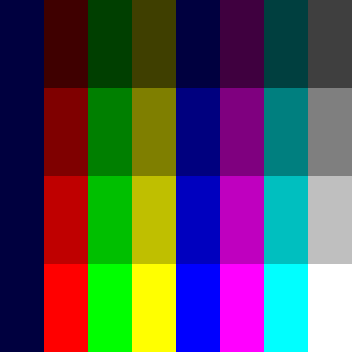
Here's a picture of the texture I was using for palette lookups. For brevity, I'm only gonna talk about the 7 palette mode here, since the 3 palette mode worked the same, but just with less.
In the shader, the color drawn to the screen is given a number, with Red being 1, Green being 2, and Blue being 4. This is how the horizontal offset is determined for picking what palette will be used. The full table is as follows:
- Red
- Green
- Yellow (Red 1 + Green 2)
- Blue
- Magenta (Red 1 + Blue 4)
- Cyan (Green 2 + Blue 4)
- White (Red 1 + Green 2 + Blue 4)
The 3 color palette used Red (1) Green (2) and Blue (3), and had a lot less overall math.
In the absence of color, the top left corner of the palette is used (which matches the darkest blue color.) Once the palette has been determined, a conversion to find the luminosity of the color is done, which determines the vertical offset. This is also why it can only have 7 colors instead of 8, since in the absence of luminosity, the RGB values would be all 0. I used the background color for this, since it would make it much less obvious what was going on when the colors got darkened (see below.)
To color the image, first the raw screen drawing (with the base colors) is taken in, as well as the render texture (Gamemaker surface) with the desired palette. The sample image below demonstrates how a remapped palette would look.
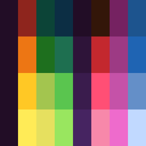
Using this system, we can draw whatever colors we want to the palette texture, and the shader would recolor the image accordingly when drawn to the screen. I'm still quite proud of this system, and would like to use it some time in the future, but it's not meant to be for Cosmogelica.
Why This Complex System?
If you're wondering why I didn't simply just use Pixelated Pope's shader from the start, it was because I wanted to do complex shading like this.
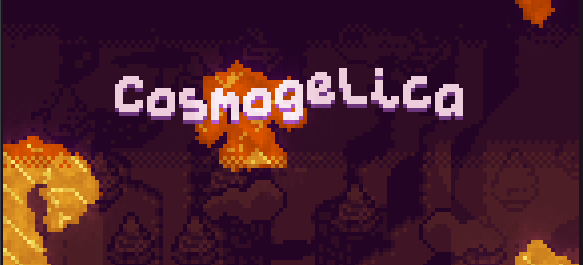
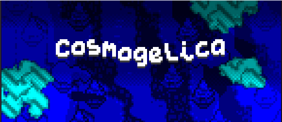
Since the shade was determined by the luminosity of the pixel, I could do gradients like this and have them automatically converted to 4 color mode.
This technique can't be replicated using the true color rendering, so I have a simple blended texture here that applies a darkening gradient in steps. It doesn't allow the dithered shading like before, but I still think it looks pretty nice, and maintains the retro feel (since many systems of the time could adjust the palette like this while drawing the game, since the scanlines were drawn vertically.)
Ok, that's really the end of the blog this time. Thank you for reading if you read through the nerd stuff! Or if you just scrolled down here to see if there was any non-nerd stuff.